One of the biggest design dilemmas we see in Texas homes is trying to create a color palette that is cohesive with your stone fireplace.
Stone fireplaces can be beautiful, of course, but if they’re not in a color you really love — or if you’re trying to go with the all-white interior trend — you might have trouble.
If you’re stuck, check out this quick guide to working with your current fireplace stone, not against it.
Step 1: Decide What Tones You’re Working With
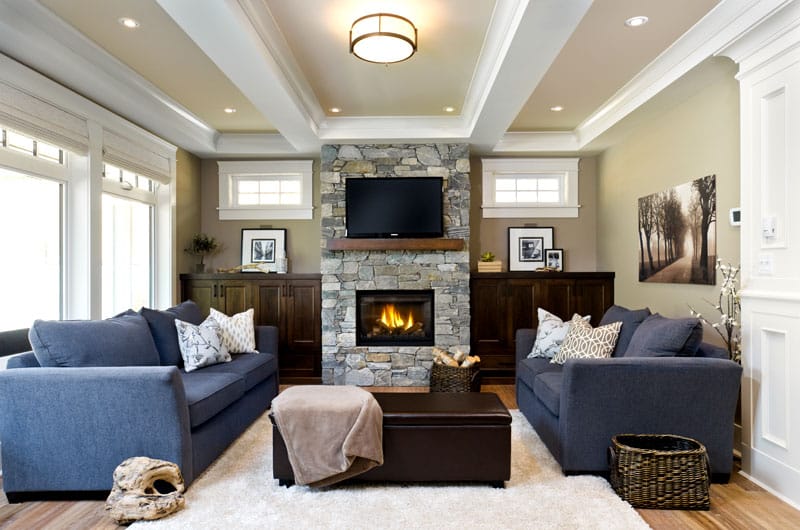
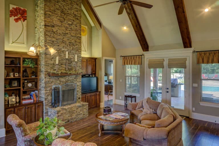
Take a look at your fireplace and decide whether the stone color feels more warm or cool to you. Warm tones might include tans, browns, and red or orange tints. Cool tones often include a range of grays with just a subtle tint of blue or green.

A fireplace with mostly cool tones (source)

Predominantly warm-toned fireplace stones (source)
Step 2: Browse Some Color Palettes
Here are 5 different color palette ideas for coordinating your “warm” or “cool” tones.
Look for one or two of your stone’s colors within these options to find a palette that works well with your space — and that you genuinely enjoy! If none really impress you, that’s okay. There are several palette creation resources online and you can simply use these as a guide in the right direction.

This is a great palette to compliment a warm-toned fireplace. To keep your space feeling light and open, opt for the lightest shades and use your darker colors as accents.

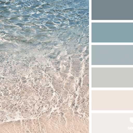
This palette would go best with cool-toned stones. The very light sand color adds just a hint of warmth, so your space will feel relaxing and inviting. Plus, these sophisticated blues are always in style.

We’ve seen green making a comeback lately, and there’s no reason it shouldn’t — it brings a fresh and rejuvenating feeling to your interior. We suggest coordinating this palette with warm-toned stone.

Another good match for cool gray tones, but for the more adventures among us! The pop of cool and playful color will keep your space from feeling too serious. It’s up to you how much color you’d want to use in your space. Simple touches will keep it subtle and sophisticated, while using the color for your larger furnishings will bring energy to the space.

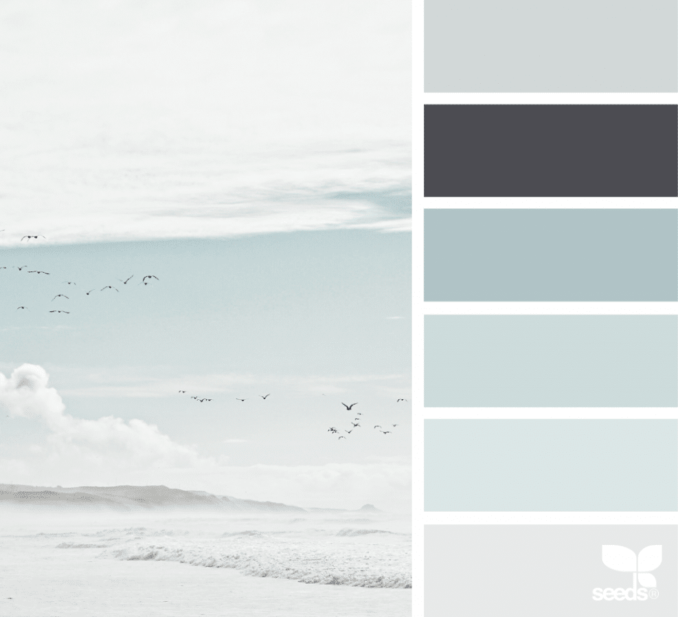
Don’t worry, we didn’t forget about the white and grey lovers… The above palette is definitely geared toward a cool-toned fireplace. If you have even the subtlest tint of blue in your fireplace stone, these blue-grays should coax it out and make it pop!
Step 3: Bring It All Together
Once you’ve selected a palette, you can starting painting, furnishing, and calling in your various home pros.
If you need help matching your treatments to your new or current palette, don’t let online selections scare you. We’re more than happy to weigh in and bring our showroom to you. There’s no better way to pick the right colors (and styles, shapes, etc.) than seeing it physically in your space.
‘Til next time!
Lana


